[UPRM]   E.O.Y.   FIRST DIRECTION
PAGE 01
FIRST STUDY
© NEWW
Initial Visual Direction

THE ACSENT
STUDY

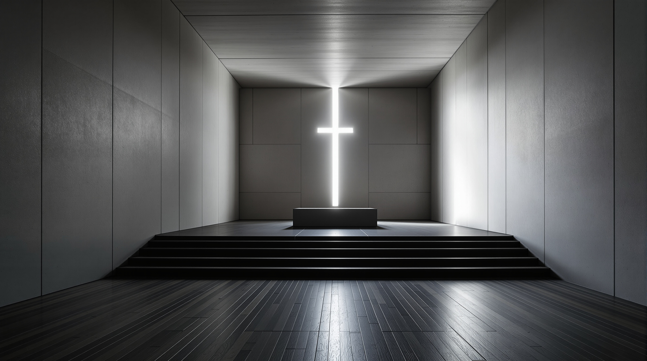
A first visual direction for Psalm 24: the arena becomes a sanctuary for ascent: soft, mineral, communal, restrained, and pointed toward the mountain of the Lord.

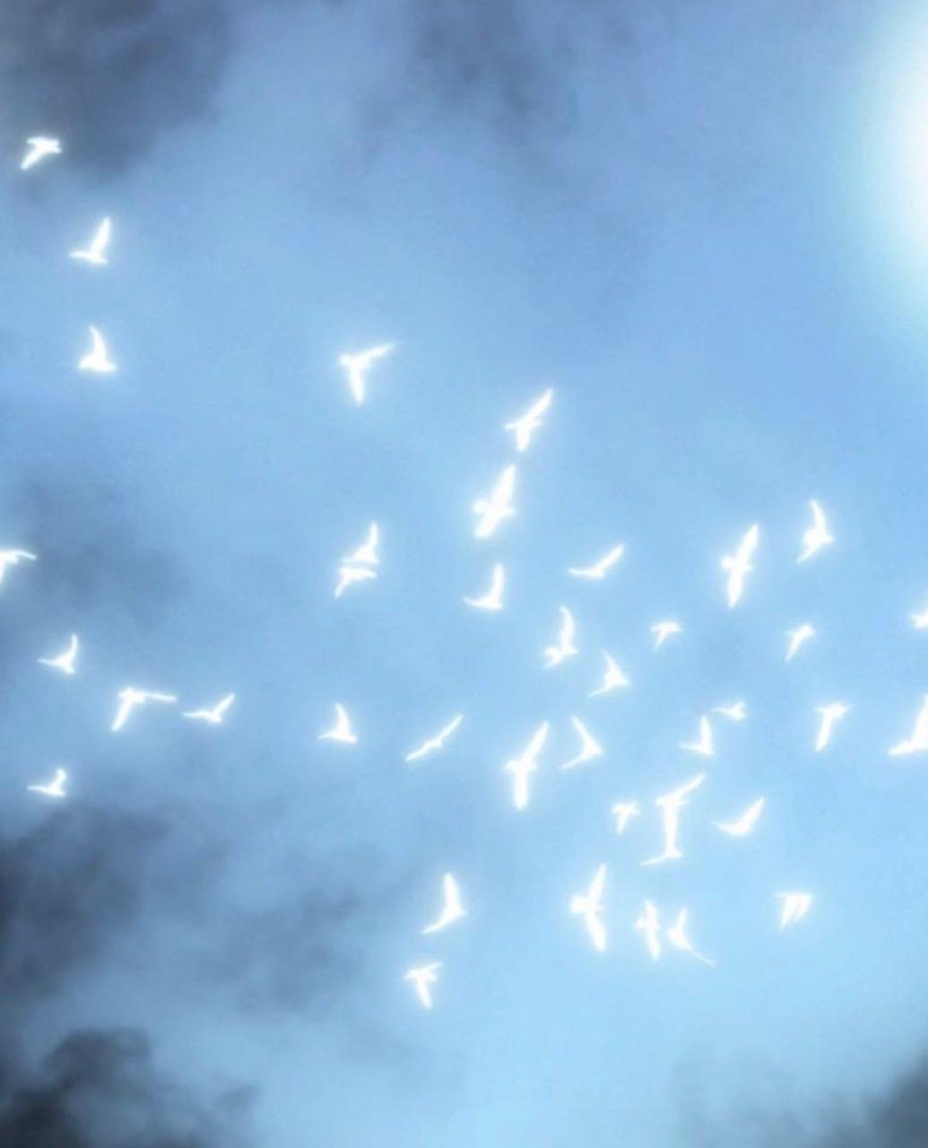
Soft supernaturalLight as hope, not spectacle.
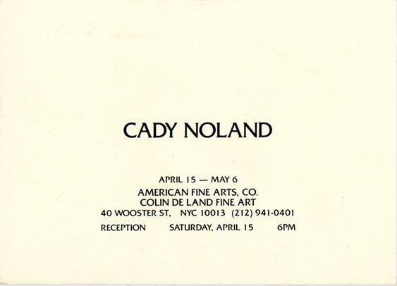
Printed restraintInvitation language, not marketing.
One gestureA room organized by light.

DESIGNED IN CALIFORNIA
[UPRM]   BRIEF
PAGE 02
PSALM 24 / ASCENT

01

“The pursuit of ascending the mountain of the Lord.”

Psalm 24 gives the direction its posture: a people moving upward in reverence, preparation, and expectation. The world should feel like an arena being re-ordered into a holy ascent: quiet enough for Scripture, strong enough to carry a room, restrained enough to feel sacred.

Ascent, not hype

The energy is upward and consecrated: a gathering moving toward the mountain of the Lord, not a conference chasing spectacle.

Reverence first

The room should hold weight, silence, prayer, Scripture, and communion before it tries to impress.

Restraint as confidence

The restraint becomes the signal that this is set apart.

Gathered warmth

Bone paper, ash texture, soft shadow, bodies gathered, light landing gently: the references should serve the climb.

[UPRM]   GRAPHIC DIRECTION
PAGE 03
INVITATION SYSTEM

03 / Graphic direction

“The invitation, graphics, and poster should feel simple and restrained: not hyping the conference, but quietly paralleling the ascent.”

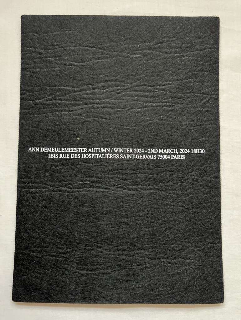
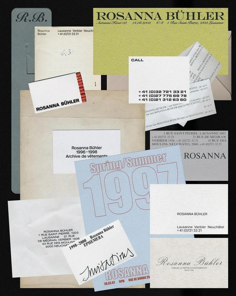
Texture cardUse texture, not heavy darkness.
Layered paperBlack / white tension softened by craft.
Fragile symbolOne poetic mark can hold the mood.
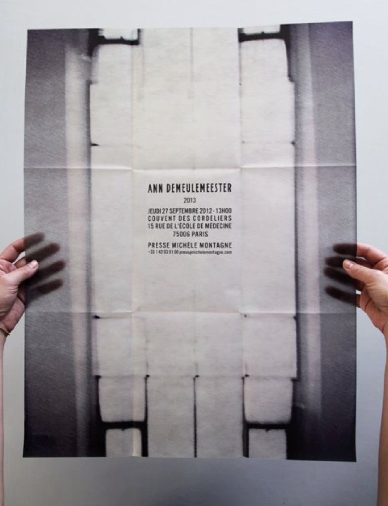
Folded posterPrinted, handled, human.

Material

Canvas, paper grain, folds, ink edges.

Type

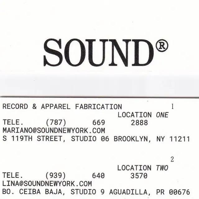
Narrow uppercase, small metadata, one clear title.

Image

Soft blur, feather, cloud, light, hands, paper.

Tone

Reverent, not theatrical. Hopeful, not ominous.

[UPRM]   VISUAL LANGUAGE
PAGE 04
FLYER STUDY

04 / What would a flyer feel like?

“A quiet invitation: restrained, tactile, and artful.”

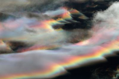
soft prismatic cloud reference
END OF YEAR GATHERING
THE ACSENT
STUDY
A first direction / light, gathering, paper, sound
More invitation than advertisement

*this is not a final graphic only reference

Format

Vertical poster, gallery invite. It should feel saved, folded, and passed between people.

Typography

One strong title. Small practical details. Narrow uppercase. No hype language.

Image treatment

Soft monochrome, prismatic light, paper grain, gentle shadows.

Copy language

Use: ascent, mountain, sanctuary, Scripture, communion, reverence, gathering, light, invitation.

Composition

Still restrained, but not empty. More touchpoints, captions, and material cues so the idea feels warm.

Hopeful ending

The system can begin severe and resolve into light: a journey from hush to lift.

[UPRM]   CLOSING DIRECTION
PAGE 05
PSALM 24

05 / Directional sentence

“A sanctuary for the ascent.”

The one idea: transform the arena into a reverent field of ascent: a place where people, Scripture, music, and light move toward the mountain of the Lord.

The familiar code: altar, procession, gathering, service, Scripture, communion.

The shift: those codes are translated through arena scale, restrained graphics, charcoal planes, soft supernatural light, and a fashion-editorial sense of composition.

The feeling: not hype, not spectacle, not fear. A room set apart for pursuit, reverence, and lift.


DESIGNED IN CALIFORNIA